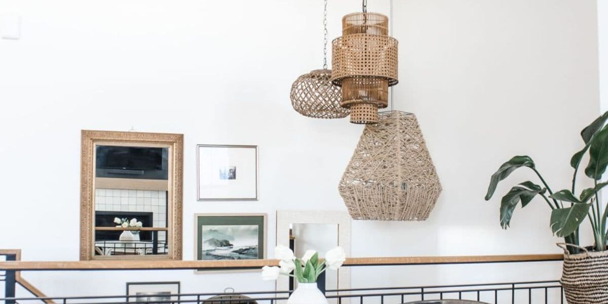
Sometimes it is not clutter. It is not a lack of budget either. It is just that subtle feeling that in a room... you cannot find your place. Everything is 'almost' right, but you bump into corners, conversations do not flow, the light does not reach where it should, and one wall stays empty like a pause that lasts too long.
When a space does not feel like Home, most of the time you do not need another object. You need a map: zones, paths and dead spaces transformed into something alive.
1) Start with the truth of the room: measure and note 'what cannot be changed'
It is not the romantic part, but it is what saves you from late compromises.
- Measure the length/width of the room (and ideally the height).
- Mark doors and the direction they open.
- Note windows, radiators, outlets, and switches.
- Write on the plan what must stay: a desk, an extendable table, a bookcase, a favorite armchair.
Then ask yourself simply: what happens here, every day? (not what you wish would happen 'one day'). Relaxation, work, dining, play, socializing, these will become zones.
2) Draw the paths: the room should let you pass through, not correct you
A space feels good when you move through it naturally. In interior design, that means respecting flow: from door to window, to sofa, to table, to balcony.
As size references for a living room, I also recommend the Houzz measurement guide: Key Measurements for Your Living Room.
My practical rule: the main path should feel 'breathable.' If you pass through tightly, you will always feel the space narrowing even if, on paper, you have enough square meters.
Quick test:
Walk through the room with an imaginary tray in your hands. If you feel you have to dodge, turn back, or go around... the layout needs a change, not more décor.
3) Choose anchor pieces (not necessarily the TV)
Many start automatically from the TV and arrange everything 'around it.' But a balanced space can have its anchor elsewhere:
- a window with beautiful light
- a fireplace (if there is one)
- a bookcase
- a dining table with presence
- a sofa that sets the conversation, not one glued to the wall by reflex
The anchor is the object that gives orientation meaning. From here you build the zones.
4) Build zones: relax / work / dining, without fragmenting the room
An uncomfortable room is often a room trying to do too many things without stating them clearly. Do not separate by force. Separate with intention.
Relaxation zone
- sofa + (one armchair or two light chairs) = conversation, not just 'facing forward'
- an accessible side table so you do not have to get up every time
- layered light: a floor lamp, a table lamp, ambient light (not ceiling only)
Work zone (if you need one)
- a desk that does not block the path
- directional light
- one element that 'connects' the desk to the rest (a color, a texture, a piece of art)
Dining zone (even in a small open space)
- chairs should be able to pull out without hitting anything
- keep comfortable distances around (and here you can use the Houzz guide, which emphasizes functional measurements for the living room) source
Fluidity trick: use rugs, light fixtures, or subtle material differences to mark zones without raising barriers.
5) Detect the 'dead space': places that exist but serve nothing
'Dead space' does not mean free space (free space is precious). It means space left by chance: the corner no one reaches, the empty wall that says nothing, the narrow strip beside the table, the gap between sofa and wall that only collects dust.
The 4 most common dead spaces:
- The empty wall (behind the table, behind the sofa, in the pass-through hallway)
- The space beside the table / island that remains without a role
- Room corner that receives neither light nor function
- The zone behind the sofa (especially in open-plan spaces)
6) My 'menu' for filling dead spaces (without overloading)
This is where the difference is made between furnished and furnished. Choose one or two solutions, not all of them.
A) Storage that looks good
- a slim console on a long wall
- modular bookcase
- low pieces that do not 'cut' the room
When it works: when you feel visual clutter and need 'a place for things.'
B) Art (not necessarily large, necessarily right)
- a statement painting
- a composition of prints
- a textile object (upholstery, rug on the wall) in cold spaces
When it works: when the room is functionally correct but feels impersonal.
C) Light as a storytelling point
- a floor lamp in a 'mute' corner
- wall sconces that shape the wall in the evening
- pendant above the table as anchor
When it works: when in the evening the room feels flat, no matter how many objects it has.
D) Plants (volume + life)
- a tall plant in a corner
- a group of small plants on a shelf
- ceramic planters for texture
When it works: when you need verticality and a gentle presence.
E) Extra seating (the most elegant 'invisible' solution)
- bench beside the table
- an ottoman that can move between zones
- a small armchair in a corner, with a side table
When it works: when the space is beautiful but does not invite you to stay.
7) Three mini layouts that fix 'awkward' rooms
1) Long, narrow living room
- path along one side (clear, open)
- the sofa not necessarily flush against the wall; sometimes a slight 'pull forward' gives you better proportions
- at the end: a reading corner (armchair + lamp + side table) instead of 'nothing'
2) Open-plan with a table lost in the middle
- the table becomes a zone through light (pendant) and a rug (if it fits)
- the nearby wall: console/sideboard for rhythm and utility
- beside the island: two well-chosen chairs, not four 'just because'
3) Square room, but without direction
- anchor: a sofa + two chairs facing each other (conversation)
- a vertical element: bookcase or large art
- dead space becomes a 'signature': a corner with a sculptural lamp and a tall plant
8) Signs that the layout is, finally, right
- You no longer have to 'squeeze' between furniture.
- You have somewhere to put a glass without getting up.
- Conversation happens naturally, without everyone staring in the same direction.
- The room has pauses: intentionally empty places, not mistakes left behind.
- When you enter, you feel the space welcomes you.
If you want, we can do it together without losing months in trial and error
If you have a room that does not feel right yet Home, send me a message with:
- a simple sketch with measurements,
- 3-5 photos,
- and what you would like to happen there, in your real life.
I help you find the right zones, natural paths, and an elegant solution for dead spaces so the room is not just beautiful but truly yours. Contact me here.